top of page
SmartBite

Overview
THE PRODUCT
SmartBite is a food delivery app that offers an easy and straightforward order process for individual or group orders, and strives to provide an optimal search customization to help users with dietary or caloric restrictions. (Individual project)
ROLE & RESPOSIBILITIES
-
UX/UI designer & researcher
-
User research, user interviews, product strategy and thinking, interaction, prototyping, testing
DURATION
November 2022 - February 2023
.png)
Identifying the problem
THE PROBLEM
According to my research, most food delivery apps:
-
often do not provide customizable searches for people with dietary or caloric restrictions;
-
are difficult to use when placing group orders.
THE GOAL
Design a food delivery app that allows users to easily place individual or group orders, while enabling them to customize their search based on dietary and caloric restrictions.
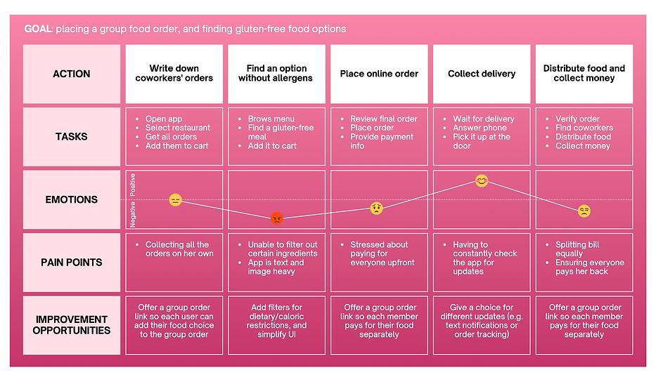
Understanding the user
USER RESEARCH
I conducted user interviews to understand the main user pain points when using food delivery apps. Users were individuals between the age of 18-65 who regularly ordered food at home through apps. From this initial research, I found three main user pain points.
USER PAIN POINTS
Search customization
Without an improved search customization, users with special diets or allergies have a hard time finding a meal to order that is compatible with their diet.
Group orders
Users sometimes feel uncomfortable placing a group order as they don't have an option to pay separately at checkout.
Crowded design
Many food delivery apps have text-heavy menus with too many images and icons that can make it difficult for users to place an order.
PERSONA & USER JOURNEY MAP
.png)
Starting the design
PAPER WIREFRAMES
I started off with drawing the paper wireframes of the app screens. I used the Crazy8 method to quickly draw some ideas for the Homepage. The final sketch was achieved by selecting the features that led to an easy and straightforward order process, consequently facilitating the user flow.

DIGITAL WIREFRAMES & LO-FI PROTOTYPE
From the sketches, I designed a digital version of the wireframes. Before moving onto the mockups, I conducted a first round of usability studies to improve the low-fidelity prototype.
Based on its findings, I decided to prioritize the following elements:
-
the cart was moved to the right corner of the bottom navigation to mimic the steps of the shopping process
-
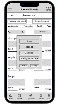
a "save" and "apply" button were added in the filters window so it would be clear when filters are applied
-
an individual or group order option at checkout were added
-
images, and not just buttons, were made clickable when selecting an item to add to the cart
-
improved language for the button labels


Above are the final results of the digital wireframes. You can check out the low-fidelity prototype on Figma.
Finalizing the design
USABILITY STUDY
After turning my low-fidelity prototype into a high-fidelity one, I conducted another round of usability testing with 5 new participants. The findings helped me enhance the user-friendliness and intuitiveness of the designs.
The main insights were:
-
the function of the location icon was unclear
-
the reward card icon was considered unnecessary in the bottom navigation
-
users wanted to see the number of items added to the cart
-
users did not like the pop-up modal for the filter menu, and would prefer a bottom drawer window instead
-
users were unsure if the filters were applied to their search
-
the language "filter by" was unclear to some users
-
users were unable to select multiple filters at the same time
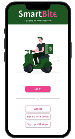
At this point of the design design process, I also decided to change the name of the app, as I wanted to better highlight its purpose of allowing smart food selections based on dietary or caloric restrictions.
MOCKUPS & HIGH-FIDELITY PROTOTYPE
Based on the results from the second usability study, I proceeded to adjust and improve my mockups. The finalized designs included a friendly interface with a simple colour scheme of white, green and pink.


The improvements aimed at targeting the user pain points discovered in the second round of usability studies. The final high-fidelity prototype presented a cleaner user flow for applying filters and the checkout process. It also introduced new features, such as the ability to save one's favourite restaurant by clicking on the heart icon.
You can check out the high-fidelity prototype and try a demo of the app.
Going forward
IMPACT
It's encouraging to witness how the app is addressing users' needs. According to one of the users:
"The app is very clear and easy to use. Dietary restrictions are typically not taken into considerations in food delivery apps, so it is amazing to have the possibility of customizing my search.”
NEXT STEPS
Additional user testing
Conducting another round of usability studies to validate whether user pain points experienced while using the app have been effectively addressed.
Accessibility improvements
Ensuring ongoing enhancements and accessibility improvements, such as adding alt text to images for screen readers, and more language options for non-English speakers.
bottom of page