top of page
Farm-to-Plate Marketplace: Dashboard

Overview
THE PRODUCT
Farm-to-Plate Marketplace (F2PM) is a Vancouver-based non-profit organization that offers a virtual farmer's market. By connecting customers to local farms, and by adopting a pay-what-you-can method, F2PM grants affordable and sustainable produce, promotes community development, and aims to facilitate communal problem-solving through data transparency. I worked with them to design a dashboard for their website. (Client-based project)
ROLE & RESPONSIBILITIES
-
UX/UI designer
-
Visual design, product strategy and thinking, interaction, prototyping
DURATION
April 2023 - July 2023
Identifying the problem
THE PROBLEM
F2PM wants to achieve data transparency by giving users access to all program data. However, users do not understand the current available data and how it is displayed.
"There is so much data I want to share with the community, but I am unable to explain it in a way people can understand." - Founder and director of F2PM
THE GOAL
Design a dashboard showcasing F2PM's weekly analytics, enhancing accessibility and readability for users, and consequently promoting communal problem-solving.
Research
USER PAIN POINTS
The research conducted for this project diverged from my usual methods. It involved informal discussions with users during F2PM community events and several one-on-one meetings. Additionally, I engaged in multiple sessions with my client, the director of F2PM, to grasp their vision for the new interface and delve into their own findings. The following pain points needed to be addressed:
-
Difficulty finding the program's data
Users have difficulty finding and accessing the program data, as it is quite "hidden".
-
Unclear data
Users do not understand the current data. The language used is very unclear and no explanation is provided.
-
Lack of visuals in the data provided
The data provided does not have sufficient visuals which makes it difficult for users to read and understand it.
-
Website is not responsive
The current website is not responsive, so accessing it through a phone or tablet is much more difficult.
PERSONA & USER JOURNEY MAP
Based on the user feedback received, and the insights gained from the meetings with the director, I created a persona in order to better empathize with F2PM's customers, and address their pain points.


Starting the design
PAPER WIREFRAMES
The first sketches of the dashboard for F2PM were designed keeping the users' pain points in mind, as well as my client's requests. The main focus was providing easy access to the most important data, with the possibility of exploring more details if desired.

I started with drawing different layout options, and then I used stars to mark the elements I considered essential for creating the initial wireframes.
DIGITAL WIREFRAMES
This process was very challenging. My client and I met multiple times to discuss the most important data to present to the public, and what instead could have been left more hidden. We also agreed that we wanted to:
-
Give users the option to see more details, without overwhelming them with too much data.
-
Separate the data into different categories to make it more readable.
-
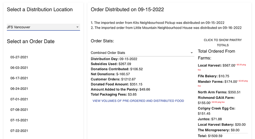
Provide information about the purchased food, such as quantity and distribution details.
-
Provide statistics on the participating farms.
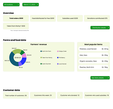
In the Overview section, users can immediately see the most important data
The data is categorized into three sections (Overview, Farm & Food Data, Customer Data) so as to enhance its comprehensibility.
.png)
If users desire, they can delve into additional details on the data, avoiding being overwhelmed by too much data presented at once
Finalizing the design
MOCKUPS
While designing the mockups I kept the colour scheme of the existing website, which mainly included white and different shades of green. However, I was not satisfied with the first attempt, and decided to change the layout to make the design look more compact.

Following the meeting with my client to go over the mockups, they expressed their worry about specific data not being showcased. Consequently, we reached a consensus that a couple of design modifications were required, in particular:
-
Adding explanations when hovering over the data to clarify its meaning or add more information.
-
Using a bar graph for the overview section so users can visually compare its data.
-
Using more icons to help users visually understand data.
-
Adding another chart to show food data, specifically where it went.
-
Moving the farm names next to each section of the pie chart, rather than having to find it by colour association.
-
Revising the community data section to add more information on subsidies and donations.
Upon implementing these adjustments, the designs were finalized, and exhibited significantly more captivating and transparent data for the public. The comparison between the initial and updated designs is presented below.
.png)
HIGH-FIDELITY PROTOTYPE
After incorporating all the essential interactions, the high-fidelity prototype for dashboard was ready, and it included the finalized version of user flows. The final design empowered users to access an extensive range of data, explore additional charts, and hover over elements for in-depth details or data explanations.

Since users visit the website from different devices, I also developed a responsive version tailored for tablets and mobile devices. This will guarantee a pleasant and uniform user experience across several devices.


You can check out the web version of the hi-fi prototype on Figma.
Going forward
IMPACT
My client was happy with the final design for the dashboard, as it was responsive to the needs of the community.
-
It aids data transparency by providing a clear and visible area to access the program data.
-
It gives users access to readable and straightforward data.
-
It promotes community engagement and communal problem-solving.
-
It is in line with F2PM's brand identity.
WHAT WAS LEARNED
Designing a new section for an existing website was a fun but challenging experience. I had to be creative while being mindful of the website UI and brand identity, but also my client's requests, and, most importantly, the user needs. Collaborating with F2PM was an extremely rewarding experience, as my designs will enable data transparency, improve community engagement, and aid communal problem-solving.
NEXT STEPS
Usability testing
Conducting usability testing to verify the validity of the new designs and confirm user-friendly data readability, while also identifying potential areas for enhancement.
Accessibility
Ongoing accessibility improvements, such as adding alt text to images for screen readers.
Product development
Progressing the designs to product development, and collaborating with a cross-functional team of engineers to support them in the development of the designs.
bottom of page