top of page
ResLink

Overview
THE PRODUCT
ResLink is a website designed for residents of buildings. It provides a centralized platform for communication and information sharing between residents and building management, and for accessing services and resources, while creating a sense of community. (Individual project)
ROLE & RESPONSIBILITIES
-
UX/UI designer & researcher
-
User research, user interviews, product strategy and thinking, interaction, prototyping, testing
DURATION
February 2023 - April 2023
Identifying the problem
THE PROBLEM
Communication and information sharing between building management and residents of buildings can be difficult and inconsistent.
THE GOAL
Creating an online portal for residents of buildings that enables communication with building management and facilitates a variety of tasks, such as booking amenity rooms, while promoting a sense of community.
Understanding the user
USER PAIN POINTS
From the initial research, I discovered five main pain points that residents were facing.
-
Difficulty accessing building information
Residents have difficulty accessing important information, such as building announcements or scheduled maintenance activities.
-
Limited channels of communications
Residents face difficulty in sharing ideas amongst themselves, and in communicating with their building manager.
-
Lack of responsiveness from building management
Building management is unable to assure a prompt response to all requests made by the residents.
-
Difficulty booking common areas
Residents find it difficult to book rooms in the building, and wish there were an easier and faster system to do so.
-
Frustrations with visitor parking
The inconvenience of giving a physical parking pass to their guests creates a lot of frustrations amongst residents.
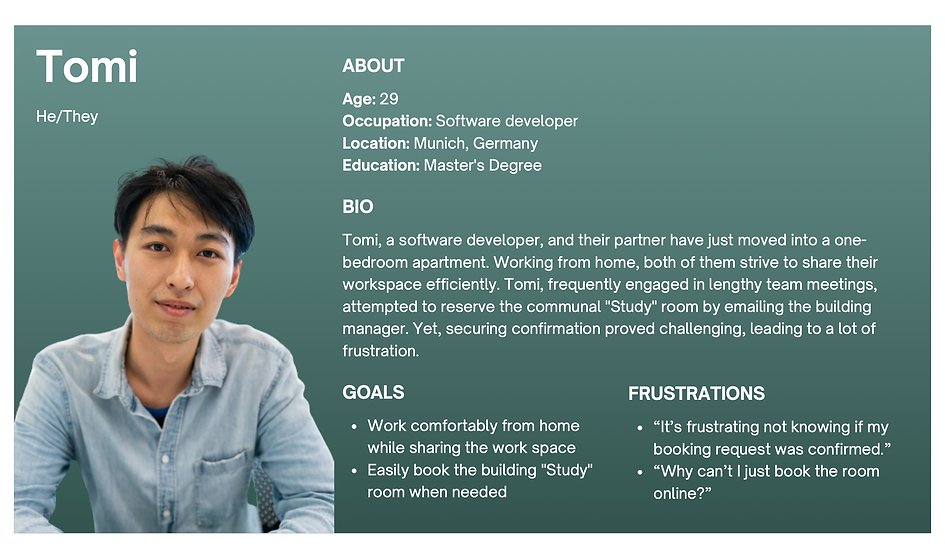
PERSONA & USER JOURNEY MAP
-1%20(dragged)_tiff.png)

Starting the design
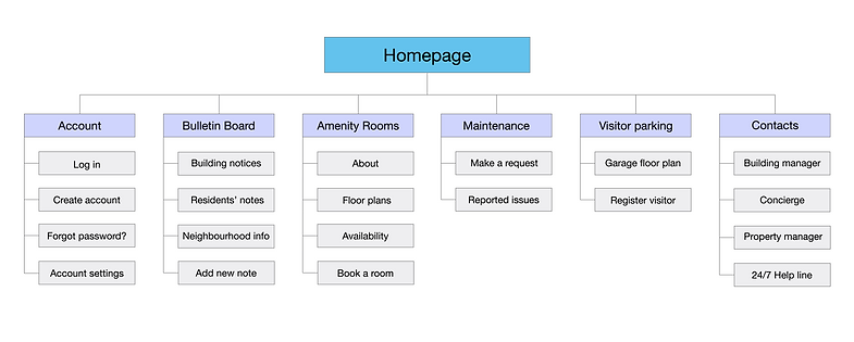
SITEMAP
The first step was to create a sitemap of the ResLink website. The goal was to make strategic information architecture decisions, so that the navigation would address all the users pain points, and would result fast and intuitive for the users.
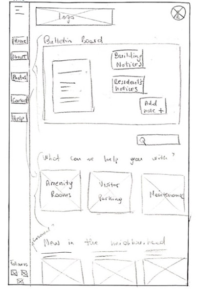
PAPER WIREFRAMES
I started off with drawing the paper wireframes of the website homepage. I also designed the paper wireframes for mobile screen sizes to make the website responsive to the different devices that residents will use to access it.

DIGITAL WIREFRAMES & LO-FI PROTOTYPE
Throughout the initial design phase, screen layouts were based on an improved version of the paper wireframes.
A navigation bar to allow easy access to the main pages of the website

The main action buttons are placed at the top of the homepage
A bulletin board to easily access communications from the building manager, and to share ideas with other residents
Using the completed screens of digital wireframes, I created a low-fidelity prototype by connecting all the screens involved in the primary user flows, which included:
-
booking an amenity room
-
adding a note on the bulletin board
-
registering a visitor's car using the visitor parking lot
-
requesting maintenance in a common area
You can view the ResLink low-fidelity prototype on Adobe XD.
Finalizing the design
USABILITY STUDY
I conducted a usability study on the low-fidelity prototype, so that the findings would guide me in creating the final mockups. I tested 5 participants who were individuals between the age of 18-70, and residents of modern buildings (built after 2014) in Vancouver, BC. The main user pain points were in the following areas:
-
List of reported maintenance issues
Users wanted to be able to see the previously reported issues under “maintenance”, in order to avoid reporting the same issue again.
-
Managing visitors
Users wished they were able to see their current registered visitors as well as manage the list of recurring visitors.
-
Certain document details should be optional
Some details asked while filling out the forms for booking and for registering visitors seem unnecessary to users.
-
Unclear language
While registering a visitor, some user found that the term “previous visitor” was unclear.
MOCKUPS - BEFORE & AFTER
The final mockups were based off the digital wireframes, and improved thanks to the insights from the usability study.
Below you can see an instance of the changes made in the Visitor Parking page.

Before the usability study
Users were only able to register a visitor, see the garage floor plan, and read the parking rules.

After the usability study
I added the button “manage my visitors” to give users the possibility to check if the registration of a visitor went through, as well as to view and edit all the “recurring visitors”.
Another instance is the Maintenance & Requests page.
Before the usability study
Users were able to request for maintenance, but they wouldn't have know if the same request had already been made by someone else.

After the usability study
I added a list of “previously reported issues” to allow users to see what was already reported, and avoid reporting the same issue multiple times.

MOCKUPS - FINAL DESIGN
The final mockups of the main screens are illustrated below in this order: Homepage, Amenity Rooms, Visitor Parking, and Maintenance & Requests.


HIGH-FIDELITY PROTOTYPE
Finally, I connected all the screens and added the necessary interactions for the high-fidelity prototype, which you can check out on Adobe XD.

I included screen size variation for mobile devices. Since users will likely access ResLink from a variety of devices, creating mockups in different screen sizes optimizes the browsing experience, and ensures that the user experience will be consistent across a range of devices.

ACCESSIBILITY CONSIDERATIONS
Visual hierarchy
I used headings of different sizes for clear visual hierarchy, which helps screen readers understand the structure of the content and navigate the website more easily.
Colours and navigation
I provided sufficient colour contrast between elements and background, as well as clear and consistent navigation options, to ensure the content is readable by users with visual impairments.
Consistent layout
I used consistent and predictable layout across the website to make the navigation intuitive for users, so they can anticipate what will happen when they interact with a particular element.
Going forward
IMPACT
ResLink is a website responsive to the needs of residents of buildings.
-
It improves communication with the building manager.
-
It enhances convenience by providing a centralized platform to access building resources and services.
-
It fosters a sense of community by connecting and engaging residents.
WHAT WAS LEARNED
Designing a website for residents required me to adopt a user-centric approach with focus on accessibility, clear navigation, and usability testing. By designing a website that meets the needs of residents, I was able to improve their overall satisfaction with the building, and create a more engaging and enjoyable living experience.
NEXT STEPS
Additional user testing
Conducting another round of usability testing to validate design changes added in the final mockups, and to verify if any adjustments or new features are required.
More screen size variations
Designing more screen size variations, such as tablets, to ensure optimal user experience across all devices.
bottom of page